An architecture practice, made easier to understand
A self-initiated interface study for an established practice with strong projects and an unclear route to an enquiry.
A fictional European architecture practice with an existing project archive and an established visual identity. It is a design exercise, not a client engagement.
Current friction
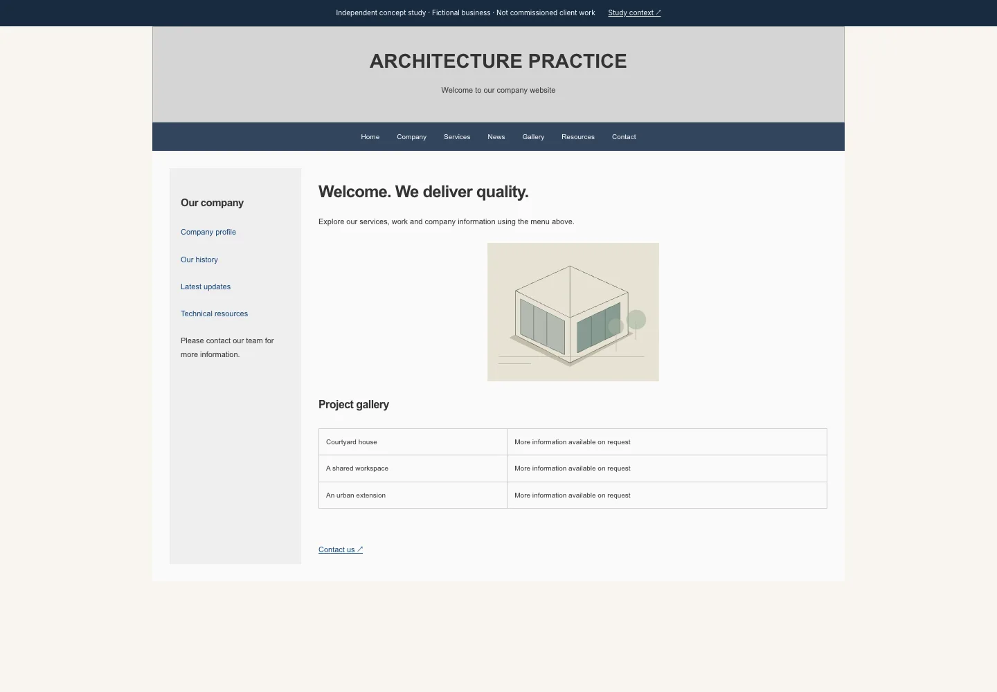
Dense navigation, a generic welcome message, small project previews and a contact action hidden at the end of the page.
What we kept
The practice’s project descriptions, service categories, existing brand tone and project archive. Sample content and project illustrations are fictional.
What we changed
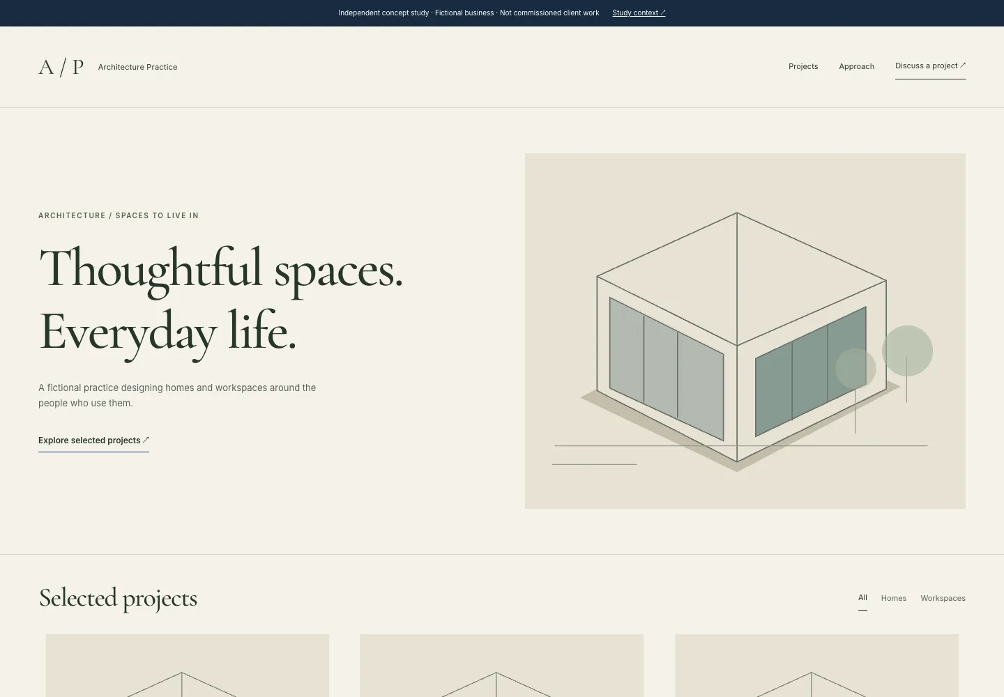
A concise service proposition, a readable project hierarchy, responsive project cards and a visible project-enquiry action.
Technical approach
A working HTML/CSS prototype with semantic sections, meaningful headings, labelled links, visible focus and mobile reflow. No client performance or conversion results are claimed.
VISUAL DEMONSTRATION
Before. Findings. After.
Both views are intentionally constructed, working prototypes for a fictional business.
Created independently by other types. No real company commissioned or approved this work. Product and project details are illustrative. This demonstrates an approach, not client results.